So with the degree show opening around 3 weeks away, the show build began. The aluminum prints sitting in sets one above the other was first only considered due to lack of space, but I felt that this had greatly helped the projects over all look. This is due to the complimentary form in each image next to one another, and the 3cm space in between each image allows the images to become part of a set, rather then individual standalone images. I feel that overall the project has been a huge success, and I am looking forward to feedback on the 7th of June on the opening night. I also hope to get some feedback on the magazine I have created, which sits next to the wall piece, as I feel this is just as strong as the main piece.

On Monday I managed to persuade the building manager of the Science Centre to let me venture upon the roof. I had prior to this been informed of the sustainable features upon the roof, but I had no idea that it would be as perfect as it was, for formalist imagery. When I first stepped out onto the over exposed roof I was immediatly surprised by the amount of what seemed to be pebbles on the floor. I later learned that these were utilized for insulation, and that they also collect water from rain, which then is absorbed into a foam like material for further insulation of the building. The roof was also littered with repeated windows from the buildings skyline. I found that they are on an automatic mechanism, which opens the windows if the building gets too hot. The final feature which I photographed was the solar panels, and I was surprised at how well the use of symmetry could portray the panels upon the roof. Overall I think these images would be a nice feature in the magazine I aim to have alongside the exhibition images.

Today was successful in the progressing my end of year exhibition to a make me believe that my ideas are achievable. I begun the day by heading into uni to edit some work for the careers and enterprise module (self branding and promotional module) for my group tutorial in the afternoon. For some reason though I felt that I had not done even slightly enough, and had a slight last minute panic to print out some ideas for logos and letterheads. When I actually headed into the tutorial though I saw that my work had actually been well on its way to my desired point. And my tutor confirmed this as he endorsed my mock up of a "gorilla advertising" styled lens filter with my logo engraved in it. He also said that my logo was more than finalized (which I wasn't expecting) and this helped me become very confident in pushing my final ideas for my promotional pack. After this very positive feedback I headed to the studios to pick up my A1 exterior print which had come out very well, and overcome my expectations of clarity. I was very impressed with how much detail was kept in the building and how much vibrancy was in the image. I then went on to further my successful day by creating an online questionnaire for the staff of the Science Centre to see their opinions on the buildings design. This should help me in talking about the sustainable design based on primary research. Overall today has been a productive one, and I hope to have many more like it from now on. Above is the A1 print from today.

A more adept perspective is to redefine buildings as constructed habitats: as active, interconnected environments that engage the local ecosystem and its dynamic ecological processes. This approach focuses on the interrelationships of the external (and internal) biotic (and abiotic) components that generate such processes, while providing spaces and programs based around the inhabitants needs. 

Today I finally decided to print my most successful (in my opinion) Science Centre interior shot. I changed the color balance before printing it also, as I felt there was too much of a blue tone throughout the shot, and I thought that it would tie in better with the other images if I changed the balance. Overall I thought the print was an unbelievable success, as all the details and tonalities were kept in the print. I am now although debating about the aluminum mount, as it seems the oyster gloss has a nice effect on the reflective parts of the image. Having the image mounted on aluminum will mean a protective layer will be put over the top, thus causing a more matte like effect on the print itself.

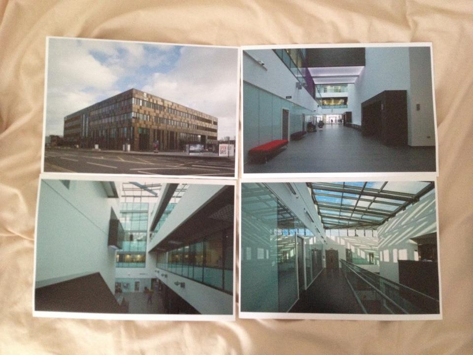
As my project has moved forward, so has my understanding and interest in the subject matter. ‘The aesthetics of sustainable architecture’ (book) allowed me to realize that design goes beyond sustainability. Design of a building can generate a mood which can reflect upon the occupier. But as sustainable architecture has become a main priority in the turn of the 21st century, the design aspect has to be worked around the functionality aspect. This means that materials used are limited, and ways in which to design the building become restricting. The two buildings which I have decided to photograph and document are the MMU Business School in Manchester, and the Science Centre in Stoke on Trent. These two buildings (both built within the last 2 years) have a very obvious similarity in design, although individual characteristics can be pulled from either. The MMU Business School for a example has, in my opinion, a very ordered and overpowering mood inside, this potentially is due to its huge open space in the centre, and repeated shaped throughout.But then the Science Centre has a very clinical feel to it, with its use of blue tinted glass, and bright fluorescent lights. But whether or not this is due to the fact that I am already aware of the buildings function is unknown to myself. So to potentially get a more rounded view into the architecture and the environmental mood it generates inside, I have decided to create a questionnaire for the occupants of the building, that way I will be able to see if the buildings themselves create a mutual mood. I hope that in turn the images that I display in the exhibition evoke these same moods or effects that the people feel who work in them. That way the images are valid representations of the buildings design, and also create relevant documents that do not manipulate the actual reality. 

I decided to print four of my potential finals on A4 oyster paper. This was to see if they worked well together and to see if this paper would be suitable for the tonalities of my images. I found that there was a consistency between how the images were composed (especially the interior ones). The most significant part about these images are that they are each from a different level of the building, and from a different corner of the building. As the building is a square shape though I intend to have four interior images, each one to represent one side and level of the building.